Tuesday 29 March 2011

Film Poster


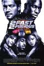
As you can see we have tried to keep our film poster as simple as possible. From the picture you can identify that the characters are located within a car, this will show to the audience that the film has some relation to the action genre. Also from the clothing they are wearing you can see that it can be related to black cinema/gangster genre. This is because they are wearing dark clothing such as hoodies and big coats. We have chosen the actors to be of a younger age as we feel it will attract the younger audience such as teenagers because this is the target audience of our film.

From the information showed you can see we have included the actors names which we feel are key as it will grab the audiences eye if they see a name they recognise. We have also included the name of the film and also the release date. Both are in quite bold letters to stand out to the audience. You can also see we have kept the same type of font and colour for the name of of the film. This is because we want each task to link together. From the red "A" it connotates that the film could involve blood and also be dangerous. This is the type of message we are trying to give off. There is also the website in the bottom corner which we feel is needed so that the audience can get extra information if needed. We decided to use dark colours as from our research other films within the same genre have similar colour types for example black, grey and navy.

The facial expressions of the actors is also key for creating an intimidating look. The audience are meant to look at this and feel quite afraid and worried. The shot is meant to seem quite intense so that it gives a message off to the audience about what the rest of the film is about.

Some of the things we are thinking of changing are trying to make it less block like and also include the phrase "keep your friends close but your enemies closer" as it appears with our magazine and we want to make a link between the two tasks.

Monday 28 March 2011

Class A Teaser Trailer


We are happy with our final piece as we feel it is what we wanted to achieve. Things like the pace starting off slow and gradually increasing i feel have been done well. This is mainly because of the sound track we have used. i feel that the editing has been done well and is continous throughout. My favourite scene would have to be the chase scene as i think it flows very well and this is the first real part of when the trailer starts to speed up.

Some of the things i would have liked to of changed would be adding some differnet location as it would give the trailer a better effect. Some better quality footage for the montage such as better hand brake turns, wheel spins and burnouts.

We are thinking of adding some more intertiles or even just some bit of texts to inform the audience what is happening. This will improve the teaser trailer as these are some of the characteristics in modern teaser trailers.

Monday 21 March 2011

Ancillary Task Ideas

For our film poster we are think about having a quite dark feel to it. It will include colours such as black, grey and any other dark colours that would fit in. We are thinking of having a car in the background of the shot with maybe 4 actors standing in front of it. This will enable the audience to see who is starring in the film and it will give them a rough idea of what it is about. They will be able to tell by the clothes that the actors are wearing and the car will also show that it includes some action within it.

We have yet to decide what will be on the front of our Empire magazine cover. It will most likely be the same sort of thing with some actors being involved and a car will most definitely be used. With the car and the rough look of the actors it will so the audience that the film is of a hybrid genre.

Some examples of Front covers and Film posters are below:

Some ideas we are thinking of taking from this poster are having the car as the main focus and the actors in the background. I like this because is obvious what genre it is.

From this poster we can see all the main actors starring within the film, we are thinking of doing the same of ours as it allows the audience to see who is in it.

I like the big bold writing in this poster. They have made the title the main focus within this poster, we want to emulate this with our so that it stands out to the audience.

This poster is good because its clearly what genre it is by having racing cars on the front. It also has to female characters on show which will attract the male audience, this is commonly known as the male gaze. This the things we want to take out from this poster are the colours used. We want to use dark colours to back up our genre.

Time Management

Today we finished off editing our teaser trailer along with putting the sound in. We feel the editing is very sharp and the continuity works well. We just need to upload it onto our blogs now. We have moved on to researching front covers of magazines and film posters for our ancillary tasks. We will be starting them within the next couple of days as we are running out of time.

Empire magazine front covers


From this and also the other magazines below we like how the empire title stands out amounst all the other things going on. This is going to draw the audiences attention to it. We are thinking of emulating something similar to this.

From this magazine i like how all the font colours similar creates a theme for the magazine which by the looks of it is transformers. We are thinking of doing the same with ours as it adds a good effect to the magazine making it look rare and special.

I like how the cartoon writing fits in well with batman, the colours here also reflect what the joker is wearing. All the colours and go together well. We will take their idea of using similars that work our genre to make it unique.

From this magazine i like how everyone is clear and stands out to the audience. Things like the picture, font etc are very well done and organised well across the page. It is quite a simple layout, this is what we want to achieve when producing our own. This is because it makes it look authentic and visually appealing to the audience.

Here are some more examples of Empire Magazine front covers. As you can see the films advertised are all of different genres however the style and layout remains fairly similar. You can see that the Empire logo stays in the same place with all of these magazines. They also always have one main feature on the front, usually a new film that is being released. It also has other films being released the same time, interviews with specific actors. The main things that come with magazines such as bar code and price is also on the front. When making our front cover we need to incorporate a similar style and layout so that it looks realistic as a Empire Magazine front cover. We will use some of their ideas ans put them into our own front cover.

Editing Pictures


Here are some pictures of us editing our teaser trailer. We are using Adobe Premiere Elements to edit our teaser trailer as you can see from the pictures above. Some of the problems that we encounted with this software was that when editing the footage and re watching it over the footage was quite laggy and therefore made it hard to analyse. It was also time consuming we uploading, this was no fault of adobe but the school network. There were some positives from using adobe though, it is a great software for editing as it has all the relevant tools needed to create a realistic teaser trailer or any type of film.

Friday 18 March 2011

Time Management

Yesterday we filmed the rest of our teaser trailer which included our montage. It all went to plan because the weather was ideal which helped us when needing to film the hand brake turn and wheel spins.

Today we captured the scenes and put them onto Adobe Premier Elements where we started editing the whole teaser trailer together. We have finished the editing now and just need to choose the right music needed to go with the trailer. We are finding it hard at the moment to find some music that will fit in with our teaser trailer. We feel that there is a good examples of continuity editing. For example during the car chase it looks very realistic, this is because it has been edited together well and flows continuously. The intertiles have also been put in and this adds to the teaser trailer making it more realistic.

Tuesday 15 March 2011

Quantum of Solace Empire Magazine Analysis


This is an example of the front cover of Empire. The film that is being advertised is Quantum of Solace, we have chosen to analyse this issue of Empire because it relates to our genre of film. The things that we will need to consider when creating our own front cover for Empire is:

- framing of shots
- font types
- font colours
- background colours
- positioning of images and texts
- language

This film is of the same genre as our own but we feel there will be some differences between both front covers. Firstly this issue is a lot lighter in colour whereas our will be darker because of its relation to black cinema. The reason why they have used light colours such as cream, light blue and red are because they are aiming there film more to the family audience whereas ours will be aimed at teenagers and young adults. We are hoping to use dark colours such as black and grey. This will give the film a rough look which is what we are hoping for. I like the fonts that they have used in this issue because it is quite basic and also stands out which will grab the audiences attention. We will be using similar types of fonts because we feel it will work well with our front cover.

Monday 7 March 2011

Film Poster ideas

This a poster for Fast Five and is a similar genre to our own. The poster draws the audiences attention through the clear images of the actors. The images of the actors stand out in the black background. It also creates a sense of mystery. The genre of the film is clearly established as the blue car is the centre piece of the poster. It immidiatly indicates to the audience that this is going to be an action film without releasing much information. The only information that is shown is the name of the film, actors names and the release date.

In our poster we will include similar things for example actors faces and an image of a car. This is because it will give the audience a clear outline on what the genre will be. We will use similar colours because it adds a certain amount of mystery to it. It will also include the name of the film and when its release date is.