Thursday 7 April 2011

How did you use new media technologies in the constructionand research, planning and evaluation stages?


Blogger


Blogger has helped us gather all our research and then therefore we have been able to put this into our trailer, magazine and film poster. The positives for using blogger must be that it is very easy to find the research we have found and made. Some problems that we have come across while using are that is very easy to forgot to post things you have learnt and found out. Also from time to time it doesn't necessary work at home.

Youtube


YouTube has been very helpful for us when we were needing to research other trailers. It has the vast majority of all films which has enabled to gather the information needed. The problems we encounted with the software was that at school it was very slow and time consuming. This may not be YouTube's fault but in fact the school connection. Overall we were happy while using this software.

Camera and tripod


The camera and tripod have been very useful. The camera has given us a clear pictures which has made our trailer look more realistic. The tripod allowed us to film fixed shots which improved the quality of our teaser trailer. It was very useful for certain scenes. The only problem we had with the tripod was that when we went out filming one time it was in fact broken so we found it difficult to film fixed shots. We also used a microphone to make the sound clearer. This added an extra effect to the trailer which improved it in whole. It enabled us to use the actual sounds rather than computer made sounds.

Adobe Premier Elements
Adobe Photoshop
We have also used other types of software such as photoshop, publisher and paint all to create our film poster and magazine front cover. These software's were very helpful as it enabled us to create a realistic poster and front cover. The positives with these software's were that they produced great quality pictures. They also had various effects to annotate the photographs. The negatives were that we found it hard to get used to at first. This was because it was the first we had used a software like this.

We also used different websites to find research and information for our teaser trailer. These were all really helpful as they allowed to see what the characteristics of a teaser trailer are. The websites included Wiki, Pearl and dean IDMB and many others.

What have you learned from your audience feedback?


From our class mates feedback we thought there were quite a few positives while also being a couple of negatives.

Positives:
. Editing was smooth and continuous throughout
. How it starts off slow and then speeds up nearer the end
. They liked how our film poster is simple but effective
. When the universal scene comes up and the music starts. They liked how it quickened the pace of the remaining scenes.
. How the magazine title links in well with the genre of our trailer
. Realistic footage to go with the genre chosen
. Punch scene looked really realistic

Negatives:
. Possibly had a couple more locations to add the the gangster effect
. Background lighting for the magazine front cover
. Some of the digetic sound doesn't quite fit together is still OK
. Kicking bit during the fight scene seemed a bit un realistic

We feel these criticism are fair and we have taken them on board. Overall we are pleased with our feedback.

How effective is the combination of your main product and ancillary texts?


Make sure the speech bubble is highlighted red to ensure annotations come up.

Since posting this video with annotations on we have changed a couple of thing on the video. Below are the changes that have been made:


Here we have tried to address the question to the audience. We feel it will get them thinking about what they would do if in that situation. With using the same red and white font as we have throughout each task it makes a link between each of them. The red also suggests danger. The words in red as also selected for a particular reason as they are the words within the question.


This intertitle is important because it is the cliché for our trailer. It has also been used with our other tasks which creates a link between each one. Again this phrase will get the audience thinking about who they can trust and who they can't. The red font is also key as it makes it stand out.


We are pleased  with our final three tasks as they have all linked well with each other. We have tried to used similar font throughout because we felt it would give it a good effect and will make each tasks link together.From the dark colours used in our teaser trailer we have attempted to use the same colour again throughout. This is because the colours all link with our teenage crime/black cinema genre. Although the film poster is quite basic and lacks information, from our research we found that most film posters are quite basic so that it gets the audience thinking and talking about the film.

I feel that with our final teaser trailer we have come along greatly from our preliminary task. I feel that footage is a lot clearer and we have been able to use many different effects that we weren't aware of when creating our preliminary task. For example we used a simple fade during the trailer which i feel  has been very effective. We have also used a time elapse in parts of the trailer, this was because some scenes needed to be speeded up to keep the pace of trailer high. We also feel all our shots are a lot more steady which makes the whole teaser trailer more professional.Various shot types were used throughout to make it more effective and more appealing to the audience.

Monday 4 April 2011

In what ways does your media product use, develop or challenge forms and conventions of real media products?

Costumes/ Props


With the dealers we decided to give them the stereotypical look of having joggers and a hoodie. This adds to the effect of it being gangstar genre. The costume gives the audience an idea of what the film will be about as well. The buyer on the other hand is wearing ordinary clothes. This is so that it looks like he could be vulnerable in that situation. It then turns out that he is by him being beaten up. He is meant to seem like a normal kid. We felt that we needed to get the costumes right in order to back up the teaser trailer being an action/black cinema genre. We felt we did well because it looks realistic.

Location

                                 
We decided to use a basic location in a car park. This is because it adds to the effect of it being an action/black cinema genre. There is also a council estate in the background which helps show what type of area it is. We felt we could have improved our film by using different locations rather than the same one for each scene. The reason we used the same location was because it was convenient for us and the actors and it always worked well for the scenes needed. I think the lighting worked well with the trailer too as all the shots came out clearly and it also added a nice dark effect to it which helped back up the genre chosen.
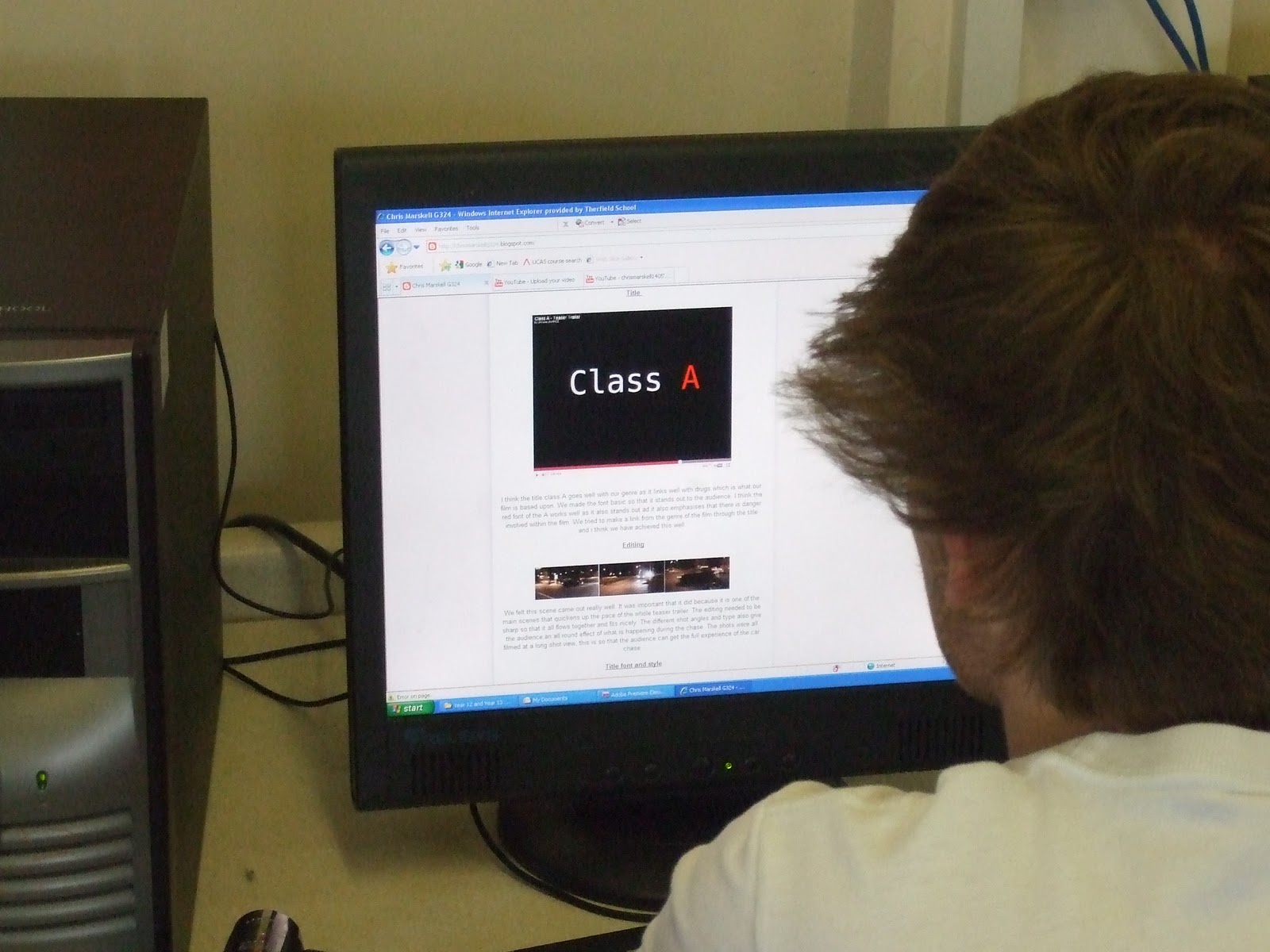
 Title


I think the title class A goes well with our genre as it links well with drugs which is what our film is based upon. We made the font basic so that it stands out to the audience. I think the red font of the A works well as it also stands out ad it also emphasises that there is danger involved within the film. We tried to make a link from the genre of the film through the title and i think we have achieved this well.

Editing

We felt this scene came out really well. It was important that it did because it is one of the main scenes that quickens up the pace of the whole teaser trailer. The editing needed to be sharp so that it all flows together and fits nicely. The different shot angles and type also give the audience an all round effect of what is happening during the chase. The shots were all filmed at a long shot view, this is so that the audience can get the full experience of the car chase.

Title font and style


We decided to use a quite basic font throughout each of the tasks. They all had similar font and styles. This was so that each task had a link between them. We kept font colours of red, white and silver throughout, this is because it adds a nice effect to each task and also links with the genre of the trailer.

Genre and how it suggests it


We have decided to go for a hybrid genre which includes both action and black cinema/gangstar. I think we have emulated both of these genre well in our teaser trailer because we have shot a fight scene, car chase and a drug deal. All of these thing would happen in an one of those genre films. Therefore we feel we have done well in trying to pull them off. I am very pleased with the fight scene especially the punch as it is performed well and looks realistic. The car chase scene has also been put together well through fast paced editing which made the whole tempo of the trailer increase and this is what we were intending on doing before shooting.

Story and how the trailer sets up

We chose to set the trailer up by starting off slow and it speeding up through each scene. It started off with the buyers entering the car park trying to pick up drugs. The shot then goes to one of them meeting the drug dealers. The pace of the trailer then picks up with the dealer punching the buyer. This then leads to a car chase and then finishing with the title of the film. We then go off to a montage of one of the actors doing wheels spins etc. This is to show the audience what they are going to expect to see in the film. During all these scenes we have a backing track playing. I think this has worked well with the scenes as it starts off slow and gradually picks up pace. It also links in with each shot very nicely.

How are the characters introduced


The dealers are shown on the left, they are wearing joggers and a hoodie. They have got their hoods up which make them look suspicious. The dealers who are played by Jack David and Jack Alis are meant to seem like they more power than the buyer. They are also meant to intimidate the buyer, they do this by what they are wearing. Dan who is the buyer shown on the right hand side, he is wearing jeans with a jacket. He also has his hood up. This is so that he doesn't draw attention to himself from others. He is meant to seem like a normal kid.

Special Effects 


We didn't use many special effects during the teaser trailer because we wanted to make it as authentic as possible. The only things that we did was speed up time in both of the scenes above. For universal it needed to be speeded up because it was a lot slower compared to the tempo of the trailer. This was also the same for the gear change. It didn't fit in well with the rest of the footage so we decided to speed it up and i think the trailer has benefited from this.


Friday 1 April 2011

Magazine front cover


This is our magazine front cover. At first we were thinking of doing an empire magazine front cover because it is well known within the media industry. We were finding it hard to emulate because we couldn't get the font to match up. So we decided to chose a magazine that was linked to our genre. Therefore we chose grime daily. We feel that the title goes well with the rest of the font and picture. The picture has also come out well which is good because it attracts the audience to it. We have included insides on other films such as shank and attack the block because they are both linked to our own film. We have tried to keep it quite basic so that the audience can visualise everything on the cover. The only thing that i would change to our magazine cover was the font of the title.

Tuesday 29 March 2011

Film Poster


As you can see we have tried to keep our film poster as simple as possible. From the picture you can identify that the characters are located within a car, this will show to the audience that the film has some relation to the action genre. Also from the clothing they are wearing you can see that it can be related to black cinema/gangster genre. This is because they are wearing dark clothing such as hoodies and big coats. We have chosen the actors to be of a younger age as we feel it will attract the younger audience such as teenagers because this is the target audience of our film.

From the information showed you can see we have included the actors names which we feel are key as it will grab the audiences eye if they see a name they recognise. We have also included the name of the film and also the release date. Both are in quite bold letters to stand out to the audience. You can also see we have kept the same type of font and colour for the name of of the film. This is because we want each task to link together. From the red "A" it connotates that the film could involve blood and also be dangerous. This is the type of message we are trying to give off. There is also the website in the bottom corner which we feel is needed so that the audience can get extra information if needed. We decided to use dark colours as from our research other films within the same genre have similar colour types for example black, grey and navy.

The facial expressions of the actors is also key for creating an intimidating look. The audience are meant to look at this and feel quite afraid and worried. The shot is meant to seem quite intense so that it gives a message off to the audience about what the rest of the film is about.

Some of the things we are thinking of changing are trying to make it less block like and also include the phrase "keep your friends close but your enemies closer" as it appears with our magazine and we want to make a link between the two tasks.

Monday 28 March 2011

Class A Teaser Trailer


We are happy with our final piece as we feel it is what we wanted to achieve. Things like the pace starting off slow and gradually increasing i feel have been done well. This is mainly because of the sound track we have used. i feel that the editing has been done well and is continous throughout. My favourite scene would have to be the chase scene as i think it flows very well and this is the first real part of when the trailer starts to speed up.

Some of the things i would have liked to of changed would be adding some differnet location as it would give the trailer a better effect. Some better quality footage for the montage such as better hand brake turns, wheel spins and burnouts.

We are thinking of adding some more intertiles or even just some bit of texts to inform the audience what is happening. This will improve the teaser trailer as these are some of the characteristics in modern teaser trailers.

Monday 21 March 2011

Ancillary Task Ideas

For our film poster we are think about having a quite dark feel to it. It will include colours such as black, grey and any other dark colours that would fit in. We are thinking of having a car in the background of the shot with maybe 4 actors standing in front of it. This will enable the audience to see who is starring in the film and it will give them a rough idea of what it is about. They will be able to tell by the clothes that the actors are wearing and the car will also show that it includes some action within it.

We have yet to decide what will be on the front of our Empire magazine cover. It will most likely be the same sort of thing with some actors being involved and a car will most definitely be used. With the car and the rough look of the actors it will so the audience that the film is of a hybrid genre.

Some examples of Front covers and Film posters are below:

Some ideas we are thinking of taking from this poster are having the car as the main focus and the actors in the background. I like this because is obvious what genre it is.

From this poster we can see all the main actors starring within the film, we are thinking of doing the same of ours as it allows the audience to see who is in it.

I like the big bold writing in this poster. They have made the title the main focus within this poster, we want to emulate this with our so that it stands out to the audience.

This poster is good because its clearly what genre it is by having racing cars on the front. It also has to female characters on show which will attract the male audience, this is commonly known as the male gaze. This the things we want to take out from this poster are the colours used. We want to use dark colours to back up our genre.

Time Management

Today we finished off editing our teaser trailer along with putting the sound in. We feel the editing is very sharp and the continuity works well. We just need to upload it onto our blogs now. We have moved on to researching front covers of magazines and film posters for our ancillary tasks. We will be starting them within the next couple of days as we are running out of time.

Empire magazine front covers


From this and also the other magazines below we like how the empire title stands out amounst all the other things going on. This is going to draw the audiences attention to it. We are thinking of emulating something similar to this.

From this magazine i like how all the font colours similar creates a theme for the magazine which by the looks of it is transformers. We are thinking of doing the same with ours as it adds a good effect to the magazine making it look rare and special.

I like how the cartoon writing fits in well with batman, the colours here also reflect what the joker is wearing. All the colours and go together well. We will take their idea of using similars that work our genre to make it unique.

From this magazine i like how everyone is clear and stands out to the audience. Things like the picture, font etc are very well done and organised well across the page. It is quite a simple layout, this is what we want to achieve when producing our own. This is because it makes it look authentic and visually appealing to the audience.

Here are some more examples of Empire Magazine front covers. As you can see the films advertised are all of different genres however the style and layout remains fairly similar. You can see that the Empire logo stays in the same place with all of these magazines. They also always have one main feature on the front, usually a new film that is being released. It also has other films being released the same time, interviews with specific actors. The main things that come with magazines such as bar code and price is also on the front. When making our front cover we need to incorporate a similar style and layout so that it looks realistic as a Empire Magazine front cover. We will use some of their ideas ans put them into our own front cover.

Editing Pictures


Here are some pictures of us editing our teaser trailer. We are using Adobe Premiere Elements to edit our teaser trailer as you can see from the pictures above. Some of the problems that we encounted with this software was that when editing the footage and re watching it over the footage was quite laggy and therefore made it hard to analyse. It was also time consuming we uploading, this was no fault of adobe but the school network. There were some positives from using adobe though, it is a great software for editing as it has all the relevant tools needed to create a realistic teaser trailer or any type of film.

Friday 18 March 2011

Time Management

Yesterday we filmed the rest of our teaser trailer which included our montage. It all went to plan because the weather was ideal which helped us when needing to film the hand brake turn and wheel spins.

Today we captured the scenes and put them onto Adobe Premier Elements where we started editing the whole teaser trailer together. We have finished the editing now and just need to choose the right music needed to go with the trailer. We are finding it hard at the moment to find some music that will fit in with our teaser trailer. We feel that there is a good examples of continuity editing. For example during the car chase it looks very realistic, this is because it has been edited together well and flows continuously. The intertiles have also been put in and this adds to the teaser trailer making it more realistic.

Tuesday 15 March 2011

Quantum of Solace Empire Magazine Analysis


This is an example of the front cover of Empire. The film that is being advertised is Quantum of Solace, we have chosen to analyse this issue of Empire because it relates to our genre of film. The things that we will need to consider when creating our own front cover for Empire is:

- framing of shots
- font types
- font colours
- background colours
- positioning of images and texts
- language

This film is of the same genre as our own but we feel there will be some differences between both front covers. Firstly this issue is a lot lighter in colour whereas our will be darker because of its relation to black cinema. The reason why they have used light colours such as cream, light blue and red are because they are aiming there film more to the family audience whereas ours will be aimed at teenagers and young adults. We are hoping to use dark colours such as black and grey. This will give the film a rough look which is what we are hoping for. I like the fonts that they have used in this issue because it is quite basic and also stands out which will grab the audiences attention. We will be using similar types of fonts because we feel it will work well with our front cover.

Monday 7 March 2011

Film Poster ideas

This a poster for Fast Five and is a similar genre to our own. The poster draws the audiences attention through the clear images of the actors. The images of the actors stand out in the black background. It also creates a sense of mystery. The genre of the film is clearly established as the blue car is the centre piece of the poster. It immidiatly indicates to the audience that this is going to be an action film without releasing much information. The only information that is shown is the name of the film, actors names and the release date.

In our poster we will include similar things for example actors faces and an image of a car. This is because it will give the audience a clear outline on what the genre will be. We will use similar colours because it adds a certain amount of mystery to it. It will also include the name of the film and when its release date is.

Monday 14 February 2011

Time Management

We are thinking of doing our montage filming during February half term, this is because this when all the actors are available and it is easier because everyone will have more time. This is the last bit of filming that we need to do for our teaser trailer. We have recently edited together the scenes of the trailer without putting in the intertitles. We have done this because we wanted to see whether the footage we created was up to the right quality. We feel this has benefited us because it has given us a good insight to what our teaser trailer will look like. Once the montage has been filmed we will edit it all together including the intertitles to see what the final copy will look like.

Sunday 13 February 2011

Music Ideas


Here are some instrumentals that we feel will fit in with our teaser trailer. We feel they link well with genre with it being teenage crime as this is stereotypically what teenage gangsters listen to. The pace of each instrumental is also key as this is what will make the footage all link together. Most of them seem to start off slow with them picking up pace later on. This is what we are looking for in our teaser trailer. This is because we are wanting to set the scene early on with the pace being slow, it will then go to a montage which is where it picks up in pace. 

Music Ideas


This song is the theme tune from the film from Adulthood. Adulthood, like our teaser trailer is of a similar genre. It deals with teenage crime and deals with the issues relating to it. This type of music is similar to what we would like in ours. However, it will be difficult to find music like this as we have to use non-copyright music. However we will try to find music of this type to fit in our teaser trailer to make it more effective and of a higher quality.

Friday 11 February 2011

Animatic


This is an animatic of our storyboard. It will give us a good outline on how long our teaser trailer will last. It shows the length of each scene and the intertitles. It also shows the stages of which the scenes will appear, this is better than a normal storyboard. Although the pictures are not very good quality they enable us to see how the teaser trailer will appear.

We could have gone into detail by adding sound tracks and so on but felt that all we really wanted to use the animatic for was a basic outline. Also we had not found the right backing track for our teaser trailer. Colour may have also improved the quality of the animatic but i feel a basic outline of how the scenes will appear is good enough.

Time Management

Today we filmed the scenes again in our teaser trailer. We managed to film all the scenes accept for our montage of quick scenes at the end. We decided to redo these scenes, because after we filmed it we realised that there were a few mistakes made. The footage was fairly shaky in certain scenes so we decided to do all the scenes again to improve the quality of our teaser trailer.

We chose to do our filming today because the conditions were perfect for filming. It was a clear night with no rain whatsoever. The car park we were using was fairly empty, therefore we were able to film without any interruptions.

Friday 28 January 2011

Teaser Trailer and intertitles

Today we have been on adobe making our intertitles and putting them into a practise Teaser Trailer. This has allowed us to see how long the Teaser Trailer is approximately going to take. The scenes have not been including therefore we have used just a black background to mask where they would be going. We have used intertitles at different points during the Trailer. This includes the motion picture association of America which comes up in most Teaser Trailers, we feel this will make the Trailer look more authentic. It will also include the release date which will allow the audience to know when its coming out. The Title of the film is used at the end of the Trailer, this is so that it will be the last thing that the audience see and hopefully remember. We are also contemplating whether we should include the directors name and also the actors name. This may be a good idea because it will allow the audience to be aware of who is starring in it and who directed it. The production company is also being showed, this will be done toward the beginning of the trailer.

Title

Today we came up with a name for our film. We are going to call it Class A. We feel that this title is appropriate for our film as the story line is a drug deal that has gone wrong and therefore Class A mixes in well with this genre. Class A is also linked with the drug dealers with them being the best around. The reason why the "A" is in red is because it will make it stand out amongst others and therefore get the audiences attention. The colour red is also symbolised as being dangerous which what our teaser trailer is about. The "A" is most likely to be bold so that emphasis is on it. The font will be nothing fancy because we want it to be hard hitting towards the audience.

Tuesday 18 January 2011

Storyboard

This is our storyboard, it is a rough idea of what will be happening in our teaser trailer. It gives all the shot types and how long each shot will last. There are sections that shows if we are using music or not.


Montage Ideas

We are hoping that our montage will consist of things like hand brake turns, burn outs, wheel spins and then close ups of gear changing, actors facial expressions etc. These are some pictures that we will try to emulate during our teaser trailer.

Wheel spin

Close up of gear stick 

Burnout 

Hand brake turn 

We feel that these quick scenes will give our audience an insight for what the film is about and hopefully will attract them to go and see it. With the scenes being fast paced it will keep the audience attracted and wanting more.

Friday 14 January 2011

Filming Update

We are still waiting to do the final bit of the teaser trailer, this is the montage that will happen at the end of the first couple of scenes. We are waiting for the weather conditions to improve so that we are able to complete the final bits of filming. The montage will include fast paced clips of hand brakes, wheel spins, close ups and many other things. We are hoping this will make our teaser trailer attractive our target audience.

Production Company


We have researched the different production companies and we have found out that the best company for our film is Universal. This is because it is a very big company within the filming industry. This means they would be able to support the film with the appropriate finance needed. Universal will be able to advertise the teaser trailer well because they are such a big company. This will be needed for us to target our target audience.

Other films of the same genre that they have produced are: fast five, 2 fast 2 furious, bad boys and many others.

Evaluation of questionnaire

From our questionnaire we have found out that Males tend to enjoy the action films because of the fast paced editing and the tension that goes with it. The younger generation are also more interested in action films and also sci fi's. This is because they can relate to the films due to the modern day technology such as xbox and other things like that. The younger audience tend to go to the cinema to watch films, this is because they want to get the full atmosphere of the film. The older audience prefer to watch films at home because they like the comfort of their own surroundings. From the findings we have also found out that younger people prefer to watch teaser trailers before going to see the film because with them having little amount of income they don't want to waste it. This means that we need to make our trailer as appealing as possible so that it gets the attention from the target audience.

Questionnaire findings

We gave this questionnaire to five randomly selected people on different age categories. These are type answers they gave...

Person 1

1. Male
2. 0-12
3. Action
4. I chose this because i enjoy watching shooting with lots of action
5. DVD
6. No
7. NA

Person 2

1. Female
2. 60+
3. Romantic
4. I enjoy watching romantic films because they are light hearted and reminds me of my younger days
5. Sky movies
6. No
7. NA

Person 3

1. Female
2. 26-40
3. Comedy/Romance
4. I enjoy a love story with elements of comedy which make me laugh
5. Sky movies
6. NO
7. NA

Person 4

1. Male
2. 13-25
3. Action
4. I enjoy this type of genre because it is fast paced and i can relate it to computer games such as COD 4 which i enjoy.
5. Cinema
6. Yes
7. Yes

Person 5

1. Male
2. 40-60
3. Sci-Fi
4.They are usual unrealistic, this helps take the stress away from every day life
5. DVD
6. No
7. NA

From this information we can see that teenagers are most likely to be watching teaser trailer. This is useful because our target audience are teenagers and young adults.

Questionnaire

1. Male or Female?

2. Age? 
0-12  13-25  26-40  41-60  60+

3. Favourite genre?  
Horror  Action  Adventure  Comedy  Romance  Sci fi  Thriller

4. In reference to question 3, why did you choose that genre?
.......................................................................................................................................

5. How do you consume films?
Cinema  DVD  Sky movies  other

6. Do you watch Teaser trailers?
Yes    No

7. If yes does a teaser trailer affect your decision to watch the film?
Yes  No

Teaser Trailer plan - Intertitles

The plan for our teaser trailer is to have quick scenes between inter titles which tell the audience important information about the film, for example title of the film, main actors, release date etc. We are thinking to have  quick edited scenes followed by a black background with inter titles coming up. We have researched other teaser trailers and some of the best have followed this idea. We think that this will benefit our trailer and overall make it more appealing to the target audience.

The intertitles are going to be fast paced and bold so that the audience get all the important infomation.